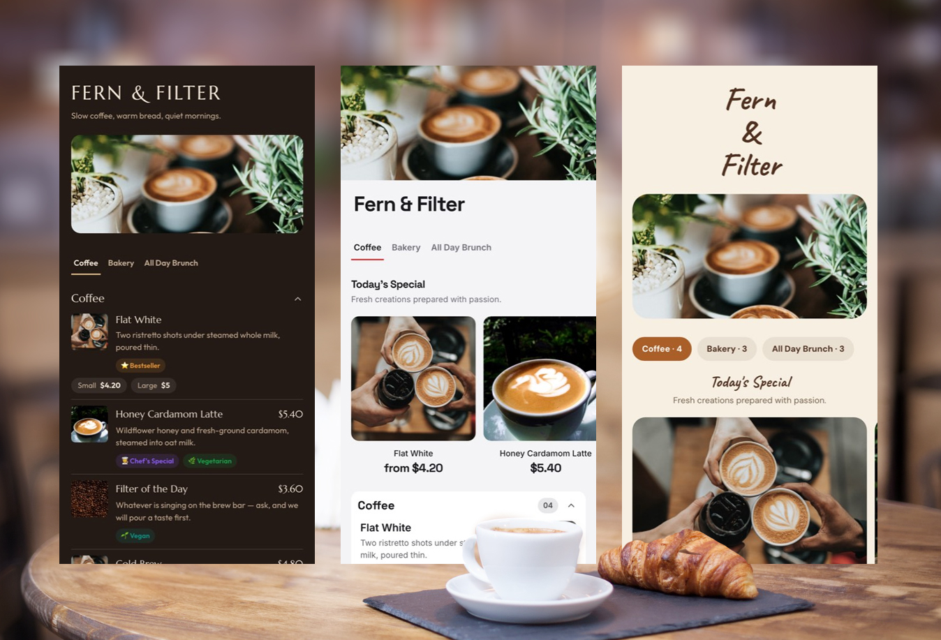
A good coffee shop menu does more than list cappuccinos and prices.
It helps customers make a decision quickly. It shows regular customers what is new. It gives first-time visitors enough information to order confidently without turning the menu into a wall of text.
That is why some coffee menus feel effortless to use while others feel surprisingly difficult to read.
The best coffee shop menu examples usually have a few things in common: clear categories, readable prices, a layout that matches the café’s personality, and enough visual hierarchy to help customers find what they want quickly.
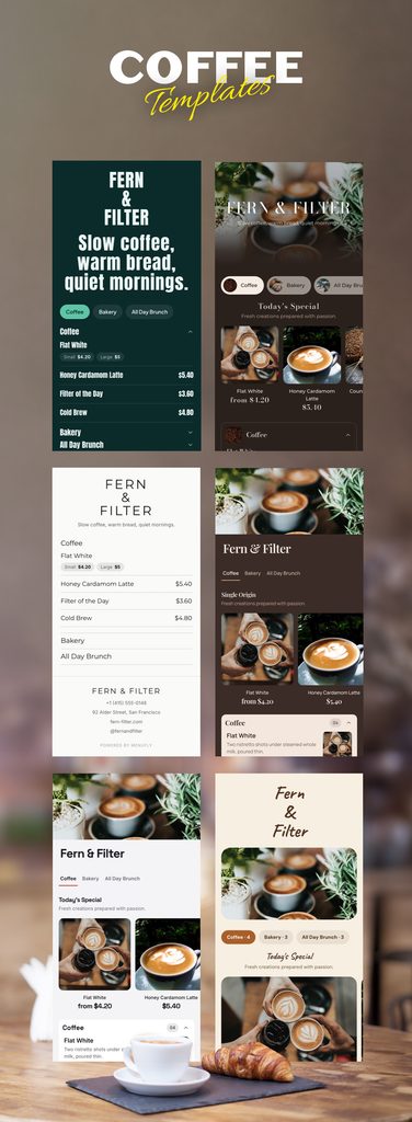
The 30 coffee shop menu ideas below will help you choose the right direction for your own café. Some styles work best for fast-moving espresso bars. Others are better suited to specialty coffee shops, brunch cafés, neighbourhood cafés, and modern all-day dining spaces.
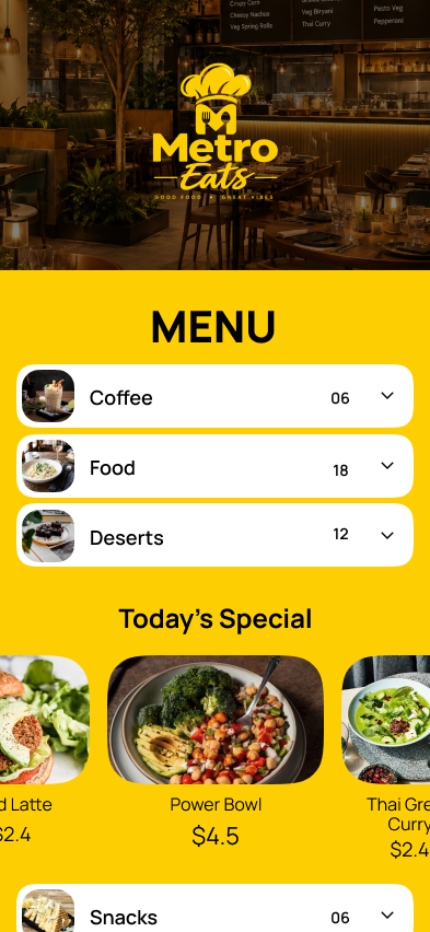
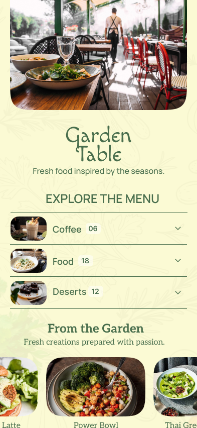
The goal is not to copy a design exactly.
The goal is to understand why a particular coffee shop menu design works and adapt the idea to your own business.
What Makes a Good Coffee Shop Menu?
A good coffee shop menu makes the customer’s next decision obvious.
For most cafés, that means organizing drinks in a familiar order, keeping repeated information under control, and making prices easy to scan.
A practical coffee shop menu usually includes:
- Clear drink categories
- Familiar coffee drinks grouped together
- Sizes and milk options without unnecessary duplication
- Easy-to-read prices
- Short and useful descriptions
- Clear separation between coffee, food, and cold drinks
- A design style that matches the café’s brand
The best menu is not necessarily the most decorative one.
A busy takeaway coffee shop serving commuters may need a completely different menu from a specialty coffee bar where customers want to read about bean origins, processing methods, and tasting notes.
Your menu design should reflect how customers actually order.
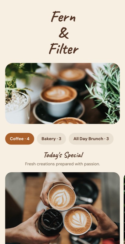
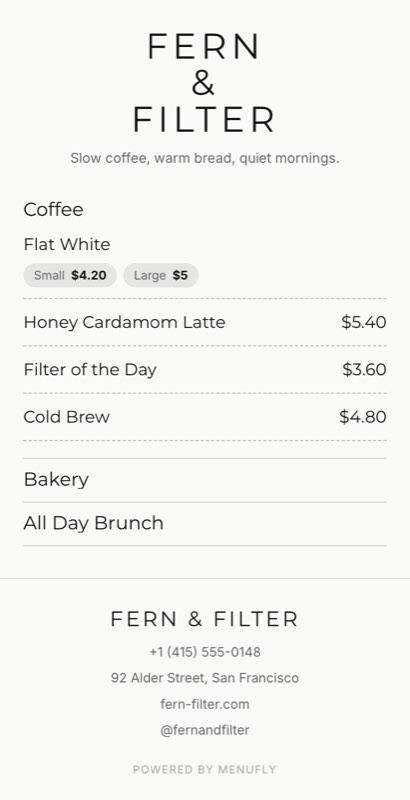
1. Minimal Typography Coffee Menu
Design style: Minimal and typography-led
Best suited for: Specialty coffee shops and modern espresso bars
A text-led coffee menu puts the drinks ahead of decoration.
For example:
ESPRESSO
Espresso — $3
Americano — $4
MILK COFFEE
Cappuccino — $4.50
Flat White — $4.75
Latte — $5
This type of menu works because customers already understand most of these products. They do not need a photograph of every cappuccino.
Menu layout strategy
Use:
- Strong category headings
- Generous spacing
- One or two font families
- Consistent price alignment
- Minimal descriptions
Key design takeaway
If your menu is already complicated, adding more decoration will not make it easier to understand. Simplify the structure first.
2. Large Counter Board Menu
Design style: Bold and functional
Best suited for: High-volume espresso bars and takeaway coffee shops
A large counter menu should be designed for customers standing several feet away.
They should immediately be able to identify:
- What you sell
- Where the coffee section begins
- What their preferred drink costs
Large category headings and strong contrast matter more here than intricate decoration.
Menu layout strategy
Place your highest-volume category first.
For example:
ESPRESSO
Espresso
Americano
Cappuccino
Latte
Then move to:
FILTER COFFEE
And finally:
COLD COFFEE
Key design takeaway
A counter board should be designed from the customer’s position in the queue, not only from a designer’s computer screen.
If the menu is difficult to read from a distance, increase the type size before adding anything else.
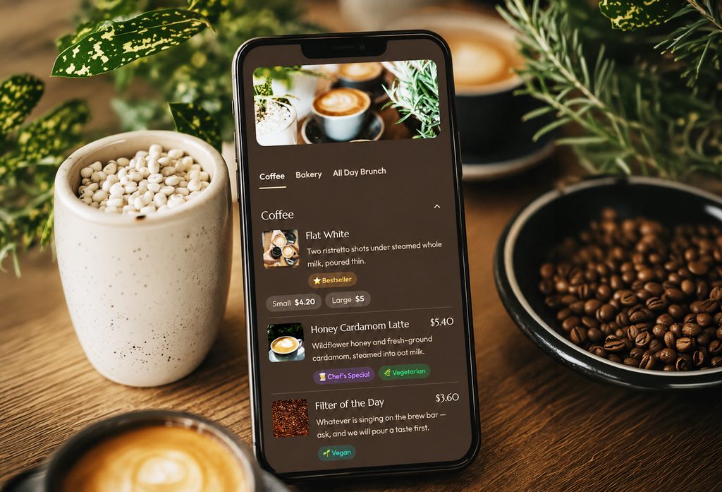
3. Editorial Specialty Coffee Menu
Design style: Editorial and information-rich
Best suited for: Specialty coffee shops and roasteries
Specialty coffee menus often need to provide more information than a standard café menu.
Customers may want to know:
- Coffee origin
- Processing method
- Roast profile
- Tasting notes
However, not every drink needs a paragraph.
A practical approach could look like this:
HOUSE ESPRESSO
Chocolate · Caramel · Balanced
$4
GUEST FILTER
Ethiopia · Natural Process
Berry · Peach · Floral
$6
Key design takeaway
Give detailed information to products that benefit from it.
Do not add the same level of technical detail to every item on the menu.
4. Compact Takeaway Coffee Menu
Design style: Compact and practical
Best suited for: Commuter coffee shops and takeaway counters
A compact coffee menu works best when the customer journey is fast.
Someone buying coffee on the way to work usually wants quick answers:
- What coffee do you have?
- What sizes are available?
- How much does it cost?
Example layout
HOT COFFEE
Espresso
Americano
Cappuccino
Latte
COLD COFFEE
Iced Latte
Cold Brew
Iced Americano
EXTRAS
Oat Milk +$0.75
Extra Shot +$1
Vanilla Syrup +$0.50
Key design takeaway
A short menu does not need a complicated layout.
The structure should be immediately obvious.
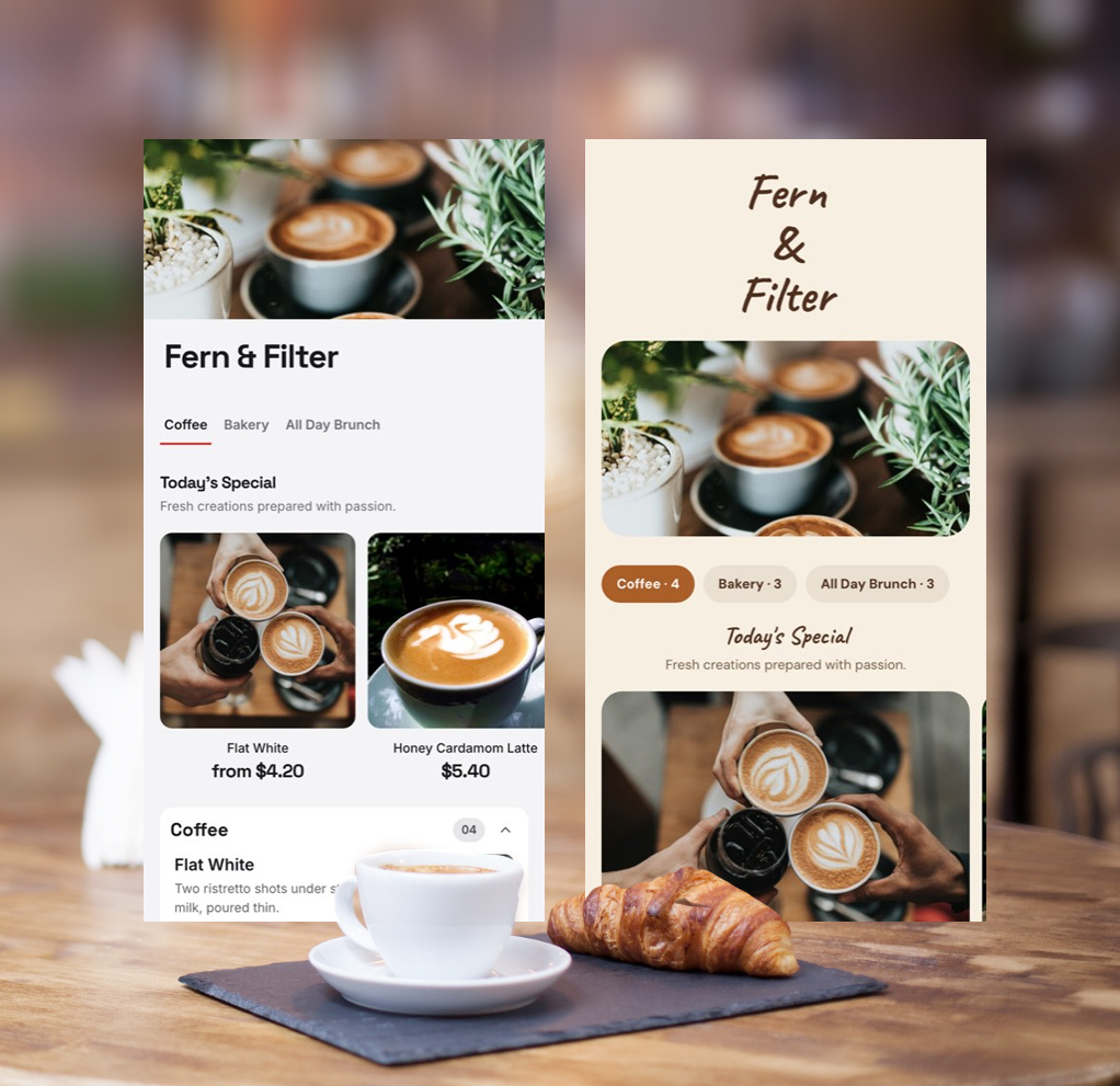
5. Warm Neutral Coffee Shop Menu
Design style: Warm and modern
Best suited for: Boutique cafés and specialty coffee shops
Warm neutral colours work naturally with coffee brands.
Cream backgrounds, soft brown accents, and restrained typography can make a menu feel welcoming without becoming overly decorative.
Menu layout strategy
Use darker text for menu information and reserve accent colours for:
- Category headings
- Best-seller labels
- Small decorative details
Key design takeaway
Warm colours should not reduce readability.
Beige text on a cream background may look attractive on a computer screen but can become difficult to read inside a busy café.
6. Coffee and Food Café Menu
Design style: Modern and structured
Best suited for: All-day cafés serving coffee, brunch, and baked goods
A café that serves both coffee and food needs stronger category organization.
A useful structure could be:
COFFEE
COLD DRINKS
BREAKFAST
BRUNCH
BAKES
This prevents coffee drinks, sandwiches, and pastries from becoming one long list.
Key design takeaway
Coffee should not compete visually with avocado toast.
Give major parts of the business their own clearly defined sections.
7. Light and Airy Café Menu
Design style: Spacious and modern
Best suited for: Daytime cafés and brunch spaces
An airy menu can make a large selection feel easier to manage.
Instead of reducing the font size to fit everything onto one page, use spacing to create breathing room.
Menu layout strategy
Leave enough space between:
- Categories
- Menu items
- Item descriptions
Avoid putting a box or border around every item.
Key design takeaway
White space is not wasted space when it helps customers scan the menu faster.
8. Neighbourhood Café Menu
Design style: Warm and approachable
Best suited for: Community cafés and local coffee shops
A neighbourhood café often benefits from a menu that feels familiar rather than overly formal.
You can use personality in your category headings.
For example:
YOUR MORNING COFFEE
instead of:
ESPRESSO-BASED BEVERAGES
Both are understandable, but the first may better match a relaxed neighbourhood café.
Key design takeaway
Use personality in headings and branding, but keep individual menu item names straightforward.
Customers should not need to decode creative names before ordering.
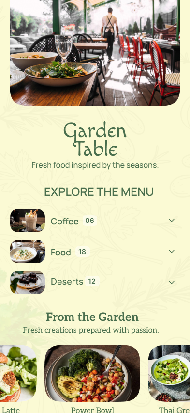
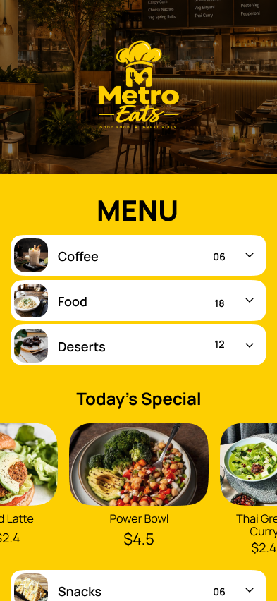
9. All-Day Café Menu
Design style: Flexible and structured
Best suited for: Cafés that operate from morning into the evening
Some cafés serve coffee in the morning and offer a wider range of drinks later in the day.
A flexible structure could include:
MORNING COFFEE
COLD DRINKS
BRUNCH
EVENING DRINKS
Key design takeaway
If your menu changes with the time of day, your menu structure should reflect that.
Customers looking for a morning cappuccino should not need to scroll through an evening drinks list first.
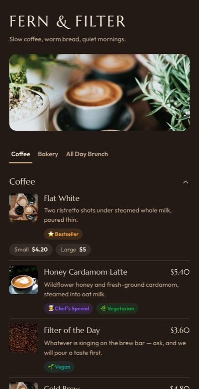
10. Dark Coffee Menu
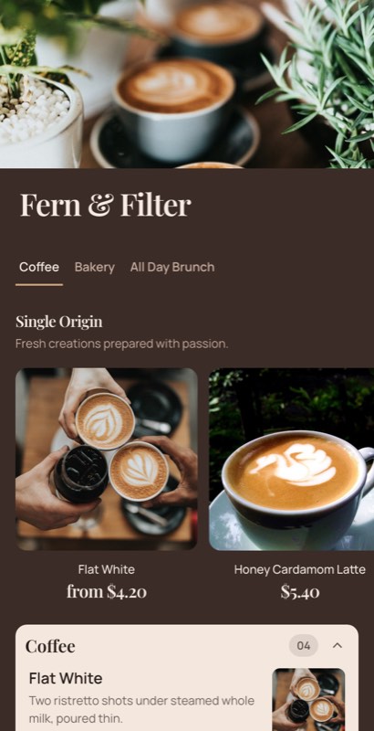
Design style: Bold and high-contrast
Best suited for: Modern coffee brands and premium cafés
Dark coffee menus can create a strong visual identity.
They work particularly well for:
- Cold brew brands
- Modern espresso bars
- Premium cafés
- Evening café concepts
Menu layout strategy
Use strong contrast between:
- Background
- Text
- Prices
- Category headings
Reserve the strongest visual treatment for signature drinks.
Key design takeaway
Dark menus only work when readability remains the priority.
Do not sacrifice contrast for atmosphere.
11. Coffee Roastery Menu
Design style: Premium and product-focused
Best suited for: Coffee roasteries and specialty coffee brands
A coffee roastery menu may serve two different purposes.
Customers may want:
- Coffee to drink now
- Beans to take home
Separate these decisions clearly.
COFFEE TO DRINK
Espresso
Flat White
Pour Over
COFFEE BEANS
Ethiopia
Colombia
Kenya
Key design takeaway
Do not mix retail coffee bags into the same visual hierarchy as your espresso menu.
They are different buying decisions.
12. Premium Espresso Bar Menu
Design style: Minimal and premium
Best suited for: Upscale cafés and hotel coffee bars
Premium design often comes from restraint.
A dark background, strong typography, and generous spacing can be more effective than excessive decorative elements.
Menu layout strategy
Use:
- Large category headings
- Short descriptions
- Clear prices
- Limited decorative details
Key design takeaway
More decorative elements do not automatically make a menu feel more premium.
Often, the opposite is true.
13. Rustic Coffee Shop Menu
Design style: Textured and relaxed
Best suited for: Independent cafés and neighbourhood coffee shops
Rustic menus can work well when the physical café already has a warm and handmade atmosphere.
Wood, brick, handmade food, and local identity can influence the menu design.
Menu layout strategy
Use subtle texture in the background while keeping the actual text on a clean and readable surface.
Key design takeaway
Background texture should support the menu, not compete with it.
14. Newspaper-Style Coffee Menu
Design style: Editorial
Best suited for: Reading cafés, bookstores, and creative spaces
Editorial-style menus can create a distinctive identity.
This approach works well with:
- Serif headings
- Grid-based layouts
- Short descriptions
- Carefully structured sections
Menu layout strategy
Think of each category as a small editorial section.
Key design takeaway
Editorial typography can give a café personality, but menu information still needs to be easy to read quickly.
15. Seasonal Coffee Shop Menu
Design style: Flexible and fresh
Best suited for: Cafés with frequently changing products
Many cafés regularly change:
- Seasonal drinks
- Pastries
- Soups
- Brunch dishes
- Specialty coffee
Instead of redesigning the entire menu every season, create a dedicated section.
THIS SEASON
Pumpkin Spice Latte — $6
Maple Cold Brew — $6.50
Apple Cinnamon Cake — $5
Key design takeaway
Customers should immediately understand what is part of the permanent menu and what is new.
16. Plant-Based Café Menu
Design style: Fresh and modern
Best suited for: Plant-based cafés and wellness-focused coffee shops
A plant-focused café may include:
- Oat milk
- Almond milk
- Matcha
- Herbal drinks
- Vegan food
- Fresh seasonal ingredients
Menu layout strategy
Use dietary labels only when they provide useful information.
For example:
GF — Gluten-Free
N — Contains Nuts
Key design takeaway
Too many icons and labels can become another layer of visual clutter.
Labels should help customers make decisions faster.
17. Clean Vegan Café Menu
Design style: Natural and minimal
Best suited for: Vegan cafés and plant-based coffee shops
If the entire café is plant-based, you do not need to repeat “vegan” beside every item.
The restaurant’s overall positioning already communicates that information.
Key design takeaway
Do not label information customers already know from the context of your business.
Use labels for additional information that genuinely helps customers choose.
18. Brunch Café Menu
Design style: Soft and welcoming
Best suited for: Brunch cafés and daytime dining
A brunch café menu should give coffee and food equal importance.
A useful structure could be:
COFFEE & DRINKS
BREAKFAST
BRUNCH
BAKES
Key design takeaway
A customer ordering brunch should still be able to find coffee quickly.
Avoid placing all drinks at the bottom of a long food menu.
19. Food-First Coffee Shop Menu
Design style: Food-led
Best suited for: Cafés where food generates a significant portion of sales
Not every coffee shop needs to place espresso first.
If brunch is a major part of your business, you could lead with:
ALL-DAY BRUNCH
followed by:
COFFEE
COLD DRINKS
BAKES
Key design takeaway
The first category on your menu communicates what kind of business you are.
Let the structure reflect your actual business model.
20. Coffee and Pastry Combo Menu
Design style: Compact and practical
Best suited for: Small cafés with pastry counters
If customers can already see the pastries in a display case, the main menu can focus on drinks and combinations.
For example:
COFFEE + BAKE
Latte + Croissant — $7.50
Americano + Banana Bread — $6.50
Cappuccino + Muffin — $7
Key design takeaway
Combinations work best when they make the customer’s decision easier.
Avoid creating complicated bundles that require customers to calculate the value themselves.
21. Bold Urban Café Menu
Design style: High-energy
Best suited for: Urban cafés with quick service
Bold layouts work well when customers are ordering quickly.
Use:
- Large category headings
- Strong contrast
- Clear price placement
- Limited descriptions
Key design takeaway
Fast-service menus benefit more from obvious hierarchy than subtle visual details.
22. Espresso-First Specialty Coffee Menu
Design style: Product-led
Best suited for: Espresso-focused coffee bars
Instead of organizing drinks alphabetically, organize them by how customers understand coffee.
ESPRESSO
Espresso
Macchiato
Cortado
MILK COFFEE
Flat White
Cappuccino
Latte
FILTER
Batch Brew
Pour Over
Key design takeaway
Alphabetical order may look neutral, but category-based organization is often easier for customers to navigate.
23. Filter Coffee-First Menu
Design style: Educational
Best suited for: Specialty filter coffee cafés
If filter coffee is what makes your café different, lead with it.
FILTER OF THE DAY
Ethiopia
Washed Process
Berry · Citrus · Floral
$6
Then move to:
ESPRESSO
MILK COFFEE
Key design takeaway
Your menu should reflect what makes your coffee shop distinctive.
24. Rotating Coffee Bean Menu
Design style: Flexible and informative
Best suited for: Roasteries and specialty cafés
If your coffee changes regularly, the menu should be easy to update.
For example:
THIS WEEK’S FILTER
Kenya
Washed
Blackcurrant · Citrus
$6
The core structure remains the same while the product information changes.
Key design takeaway
Frequently changing content requires a flexible menu system.
A beautiful design becomes difficult to operate if every update requires manually moving multiple text elements.
25. Signature Coffee Drinks Menu
Design style: Creative and brand-led
Best suited for: Cafés with original or seasonal drinks
Signature drinks deserve more visual attention than standard coffee.
For example:
HONEY CARDAMOM LATTE
Double espresso, house honey and cardamom
$6.50
KEY DESIGN TAKEAWAY
Not every item needs equal visual importance.
Use design hierarchy to guide customers toward signature or high-priority products.
26. Photo-Based Brunch Café Menu
Design style: Food-led
Best suited for: Cafés where food is a major part of the business
Photography is often more useful for food than standard coffee drinks.
A strong image of a signature brunch plate can increase appetite appeal.
A photograph of every cappuccino usually adds little value.
Use photographs for:
- Signature dishes
- Pastries
- Cakes
- Desserts
- Seasonal food
Key design takeaway
Use photography where it helps customers understand or desire the product.
27. Hero Product Menu Design
Design style: Focused and visual
Best suited for: Cafés with a few signature products
Instead of adding photographs to every item, choose three to five products for visual emphasis.
Everything else remains clean and easy to scan.
Key design takeaway
A few high-quality images can have more impact than twenty small photographs.
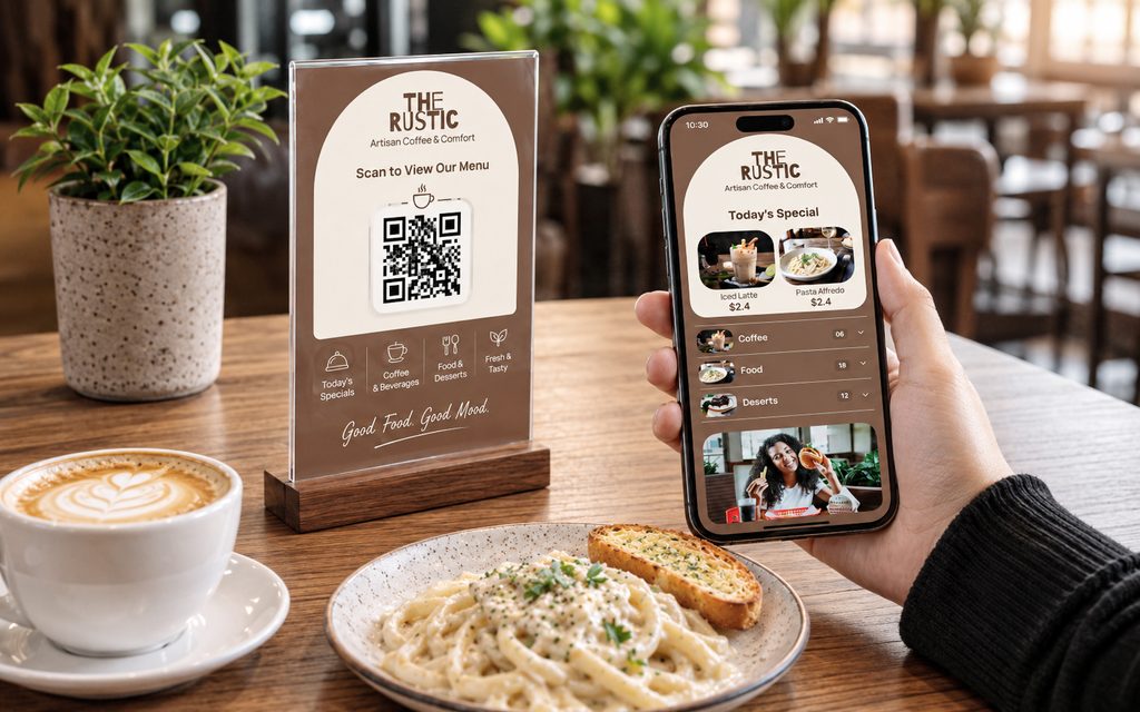
28. QR Code Coffee Shop Menu
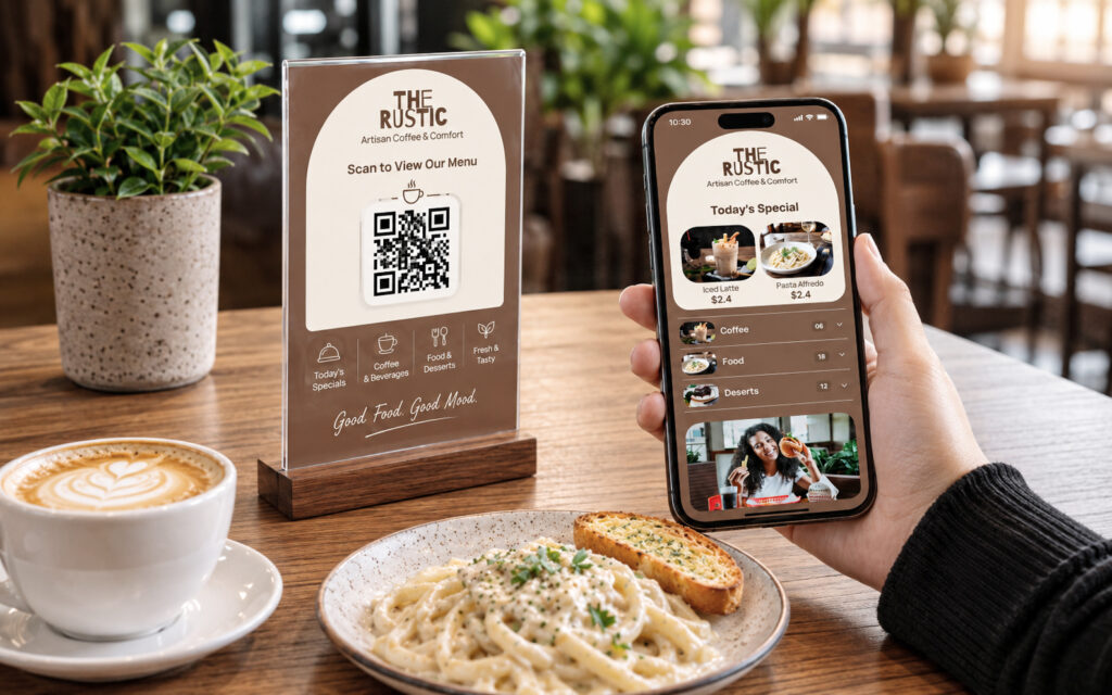
Design style: Mobile-first
Best suited for: Modern cafés and digital-first businesses
A QR menu should not simply be a printed PDF placed behind a QR code.
Phone screens are narrow.
A small print layout can become frustrating to use digitally.
Menu layout strategy
A mobile-friendly menu should include:
- Clear category navigation
- Readable text
- Visible prices
- Short descriptions
- Mobile-friendly images
Key design takeaway
A menu designed for a printed page and a menu designed for a phone are different experiences.
The information can remain the same while the layout adapts to the screen.
29. Counter Board and Digital Menu Combination
Design style: Multi-format
Best suited for: Busy cafés using print and digital menus
Customers may see your menu in several places:
- Behind the counter
- On a printed menu
- On a QR code
- On their phone
The layout does not have to be identical, but the product information should remain consistent.
Key design takeaway
Different formats can use different layouts without becoming completely different menus.
Keeping one source of menu information can also make price and item updates easier to manage.
30. Editable Coffee Shop Menu
Design style: Flexible
Best suited for: Any café with regular menu updates
A coffee shop menu is rarely permanent.
Prices change.
Coffee beans rotate.
Seasonal drinks appear.
Pastries sell out.
That is why an editable coffee shop menu is often more practical than a completely static design.
The important question is not only:
Does this menu look good today?
It is also:
Can it be updated next month without breaking the layout?
Key design takeaway
A menu should be designed for day-to-day operation, not just for presentation.
How to Choose the Right Coffee Shop Menu Layout
There is no single best coffee shop menu layout.
The right choice depends on how your business operates.
| Business Type | Recommended Menu Style |
|---|---|
| High-volume takeaway coffee shop | Compact counter board |
| Specialty coffee shop | Editorial or bean-focused layout |
| Neighbourhood café | Warm and approachable design |
| Brunch café | Separate coffee and food sections |
| Coffee roastery | Coffee-to-drink and beans-to-buy sections |
| Small bakery café | Coffee and bakes layout |
| Premium café | Minimal or dark premium design |
| Seasonal café | Stable core menu with rotating sections |
| QR-focused café | Mobile-first menu structure |
The menu should follow the business model, not the other way around.
How to Organize a Coffee Shop Menu
A practical coffee shop menu often follows this structure:
Espresso
Espresso
Americano
Long Black
Milk Coffee
Cappuccino
Flat White
Latte
Mocha
Filter Coffee
Filter of the Day
Pour Over
Batch Brew
Cold Coffee
Iced Latte
Cold Brew
Iced Americano
Non-Coffee Drinks
Tea
Matcha
Hot Chocolate
Fresh Drinks
Food
Breakfast
Brunch
Sandwiches
Bakes
This structure will not suit every café, but it gives customers familiar reference points.
One common mistake is organizing everything alphabetically.
Coffee customers generally think in categories before they think in alphabetical order.
How to Show Coffee Sizes Without Making the Menu Too Long
One of the biggest café menu design problems is unnecessary duplication.
For example:
Latte Small — $4
Latte Regular — $5
Latte Large — $6
Then repeating the same structure for every drink.
A cleaner approach is:
LATTE
Small $4 · Regular $5 · Large $6
Or:
LATTE — $5
Large +$1
The drink remains one visual unit.
The same principle can apply to:
- Oat milk
- Almond milk
- Extra espresso shots
- Syrups
- Iced options
This keeps the coffee shop menu layout cleaner and easier to scan.
Typography Tips for Coffee Shop Menus
Typography does more than make a menu look stylish.
It determines whether customers can actually read it.
Use a Clear Hierarchy
Customers should immediately understand the difference between:
- Category
- Item name
- Description
- Price
If everything looks equally important, the menu becomes slower to scan.
Avoid Too Many Fonts
Two font families are usually enough:
- One for headings
- One for menu information
Make Prices Easy to Find
Prices do not need to be oversized, but customers should not have to search for them.
Test the Menu at the Real Viewing Distance
A counter board should be tested from the queue.
A printed menu should be tested in normal café lighting.
A QR menu should be tested on a phone.
Designing only on a large desktop monitor can hide readability problems.
Should Coffee Shop Menus Include Photos?
Yes, but selectively.
Photos are most useful when they help customers understand or desire a product.
Good candidates include:
- Signature brunch dishes
- Pastries
- Cakes
- Seasonal drinks
- Desserts
Less useful candidates include:
- Standard espresso
- Cappuccino
- Americano
- Tea
If customers already know what a product looks like, a photograph may not improve their decision.
A weak photograph can also make a good product look less appealing.
Use photography where it adds value.
How to Highlight Best-Selling Coffee and Food Items
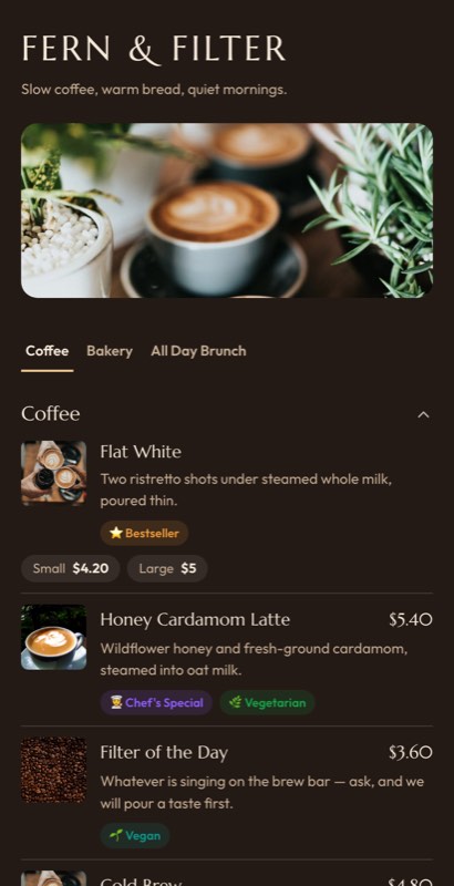
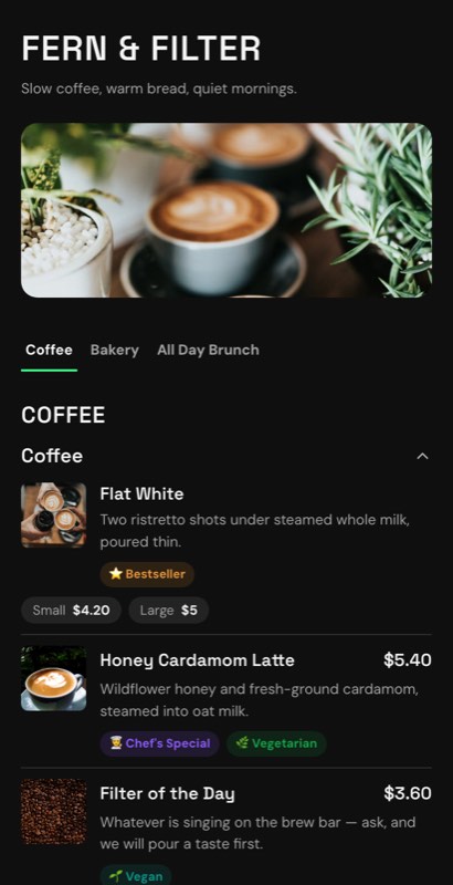
Best-seller labels can help customers make decisions, particularly when they are unfamiliar with your café.
Use one simple visual signal:
- House Favourite
- Popular
- Signature
- Staff Pick
For example:
Flat White — $4.75
★ House Favourite
The label works because it gives customers an easy recommendation.
However, if half the menu is marked as popular, the label loses its value.
Common Coffee Shop Menu Design Mistakes
Listing the Same Drink Repeatedly
Repeated size variations can make a 15-item coffee menu look like a 40-item menu.
Group options together whenever possible.
Making Prices Difficult to Scan
Customers should be able to find prices quickly.
Using Too Many Photographs
More images do not always make a menu easier to use.
Mixing Coffee and Food Into One Long List
Separate categories clearly.
Using Tiny Text to Fit Everything
If the menu does not fit, reconsider the structure.
Do not solve a layout problem simply by making the text smaller.
Overloading Specialty Coffee Descriptions
Customers may appreciate:
Peach · Floral · Honey
They may not want a technical paragraph while standing in a queue.
Treating Digital and Printed Menus as Completely Separate
This can lead to inconsistent prices and outdated menu information.
Using one system to manage the menu information while adapting the layout for different formats can make updates easier.
Final Thoughts
The best coffee shop menu examples are not necessarily the ones with the most elaborate graphics.
A great coffee menu makes ordering feel easy.
It tells customers what kind of café they are visiting, helps them find familiar drinks quickly, gives enough information for first-time visitors to order confidently, and creates room for the products that make the business distinctive.
Start by deciding what your café needs to communicate first.
A high-volume espresso bar may need a bold counter board.
A specialty coffee shop may need space for origin and tasting notes.
A brunch café may need a layout that gives food and coffee equal importance.
Once the structure is right, choosing the visual design becomes much easier.
The strongest coffee shop menu design is usually the one that fits the way customers actually order.
Frequently Asked Questions About Coffee Shop Menus
What should be included on a coffee shop menu?
A coffee shop menu should usually include coffee categories, drink names, prices, available sizes, milk options, cold drinks, and food categories where applicable. Specialty coffee shops may also include bean origin, processing method, and tasting notes.
How should I organize a coffee shop menu?
Most coffee menus work well when organized by drink type, such as espresso, milk coffee, filter coffee, cold coffee, and non-coffee drinks. Food should usually be separated into its own categories.
What is the best layout for a coffee shop menu?
The best layout depends on how customers order. High-volume takeaway shops benefit from large and simple counter boards, while specialty coffee shops often need more space for product information and descriptions.
Should a coffee shop menu have pictures?
Pictures are most useful for food, pastries, desserts, and signature products. Standard coffee drinks usually do not need individual photographs.
How many items should a coffee shop menu have?
There is no fixed number. The goal is to offer enough choice without making the menu difficult to scan. If the menu becomes too long, consider grouping options or separating categories rather than reducing the text size.
How should coffee sizes be displayed on a menu?
Avoid listing the same drink as separate items whenever possible. Show sizes as options below the main drink or use a simple size-and-price row.
Should oat milk and other alternatives have separate menu lines?
Usually, no. It is clearer to show milk choices as modifiers or options. This keeps the menu shorter and avoids repeating the same drink multiple times.
What makes a coffee shop menu easy to read?
Clear categories, strong typography, visible prices, short descriptions, good spacing, and logical drink organization all make a coffee menu easier to scan.
Can one coffee menu be used for print and QR codes?
Yes. The product information can remain consistent while the layout adapts for a printed menu, counter board, or mobile phone screen.
Where can I find editable coffee shop menu templates?
Look for templates designed specifically for cafés and coffee shops rather than adapting a generic restaurant menu. Coffee-focused templates can better accommodate drink sizes, milk alternatives, cold drinks, bean information, and frequently changing menu items.
Create Your Coffee Shop Menu
If you’re planning a new coffee shop menu or redesigning an existing one, start with a layout that matches the way your customers actually order.
Customizable coffee shop and café menu templates can help you start with a professional structure instead of designing every section from scratch. With MenuFly, you can create and update menu designs for different formats, including digital menus, QR menus, and printable menu cards, while keeping your menu information consistent.
Leave a Reply