
A good hotel menu card does three jobs. It helps guests decide quickly, it steers them toward the dishes you make the most money on, and it tells them what kind of place they are sitting in before the first plate arrives.
We have spent more than 15 years designing and printing menus for hotels, dhabas, cafes, banquet halls and fine-dining restaurants. In that time we have seen owners spend more on menus than they needed to, then reprint the whole batch months later because a price changed or a dish was dropped. We have also seen simple, inexpensive menus outsell expensive ones because they were easier to read.
This guide puts that experience in one place. You will find:
- What a hotel menu card is and what it should do for your business
- A sample hotel menu card format you can copy
- 30+ design ideas for 5 star hotels, veg restaurants, Indian restaurants and more
- The right sizes, paper and finishes, and what they really cost
- The mistakes we see most often, and how to avoid paying for them
Whether you run a 20-cover roadside hotel or a 200-cover banquet restaurant, the aim is the same: a menu that looks professional, sells well and doesn’t cost you money every time something changes.
What is a hotel menu card?
A hotel menu card is the printed or digital list of dishes, drinks and prices that a hotel or restaurant gives its guests to order from. In India, “hotel” is often used for any sit-down eatery, so the term covers everything from a highway hotel to a 5 star dining room.
That is the dictionary meaning. In practice, a menu card is your quietest salesperson. It is the one piece of marketing every guest reads, every single visit, while they are already sitting at your table and ready to spend.
What a good menu card actually does
- Speeds up ordering. Clear sections and readable type mean fewer questions to the waiter and faster table turns.
- Guides choices. Where a dish sits on the page and how it is described affects how often it gets ordered. We cover placement in the design section.
- Sets the price expectation. Heavy paper and calm layout prepare a guest for higher prices. A crowded, glossy laminated sheet signals budget, whatever you actually charge.
- Reflects your brand. Colours, fonts and logo should match your signboard, interiors and social media so the place feels consistent.
Types of menu cards you will come across
| Type | What it is | Best for |
|---|---|---|
| À la carte | Each dish listed and priced separately | Most hotels and restaurants |
| Table d’hôte / set menu | Fixed courses at one price | Thalis, lunch specials, banquets |
| Single-sheet card | One page, printed one or both sides | Small menus, cafes, room service |
| Bi-fold / tri-fold | One sheet folded into 4 or 6 panels | Mid-size menus with clear sections |
| Menu book | Several pages bound in a cover | Large multi-cuisine menus, bars |
| Table tent / table menu card | Small standing card on each table | Specials, desserts, drinks |
| Digital / QR menu | Menu opened on the guest’s phone | Menus that change often, multiple languages |
Sample hotel menu card format
Most guests read a menu the way they eat a meal: starters first, then mains, then dessert. Follow that order and nobody has to hunt.
The section order we recommend
- Soups
- Starters (veg, then non-veg)
- Main course (veg, then non-veg)
- Rice and biryani
- Breads (roti, naan, paratha)
- Thalis or combos
- Desserts
- Beverages
For a pure veg hotel, drop the non-veg splits and add sections like dal, sabzi and South Indian. For a multi-cuisine hotel, group by cuisine first (Indian, Chinese, Continental) and by course inside each.
How to lay out each dish
Each item needs four things: the dish name, a short description, a veg or non-veg mark, and the price. Keep it to that.
Paneer Tikka ● (veg) Cottage cheese marinated in yogurt and spices, charred in the tandoor. — 12
A few rules that come from fixing hundreds of menus:
- Keep descriptions under 15 words. Say how it is cooked and one thing that makes it yours. “Slow-cooked overnight” sells. “Delicious and tasty” does not.
- Drop the currency symbol and the dotted leaders. A line of dots running to a right-aligned price column invites guests to scan prices, not dishes. Put the price at the end of the description, in the same weight as the text.
- Don’t write .00 or .99. “12” looks confident. “$12.99” looks like a discount store.
- Use the green and brown/red veg and non-veg symbols if you serve both. Indian guests look for them first.
- Note allergens and spice levels with a small icon and a key, not with words after every dish.
Sample hotel menu card (text you can adapt)
| Section | Dish | Short description | Price (USD) |
|---|---|---|---|
| Soups | Tomato Shorba | Roasted tomato, cumin, fresh coriander | 4 |
| Starters | Paneer Tikka | Tandoor-charred paneer, mint chutney | 9 |
| Starters | Chicken Malai Kebab | Cream and cheese marinade, mild | 11 |
| Main course | Dal Makhani | Black lentils simmered overnight, butter | 8 |
| Main course | Butter Chicken | Tandoori chicken in tomato-butter gravy | 13 |
| Rice | Veg Dum Biryani | Basmati, seasonal vegetables, raita | 10 |
| Breads | Butter Naan | From the tandoor | 2 |
| Thali | Hotel Special Veg Thali | 2 sabzi, dal, rice, 3 rotis, sweet | 12 |
| Desserts | Gulab Jamun (2 pcs) | Served warm | 4 |
| Beverages | Masala Chai | Brewed fresh with ginger | 2 |
Prices are only placeholders to show the format; set yours from your food costs. [Editor: offer this as a downloadable “sample hotel menu card PDF” and an editable template.]
30+ hotel menu card design ideas
The best design is the one that suits your food, your prices and your guests. A black-and-gold card looks wrong in a busy family dhaba, and a bright yellow fast-food layout looks wrong at a wedding buffet. Pick the group closest to your business, then choose within it. [Editor: one original image per idea below.]
5 star hotel menu card designs
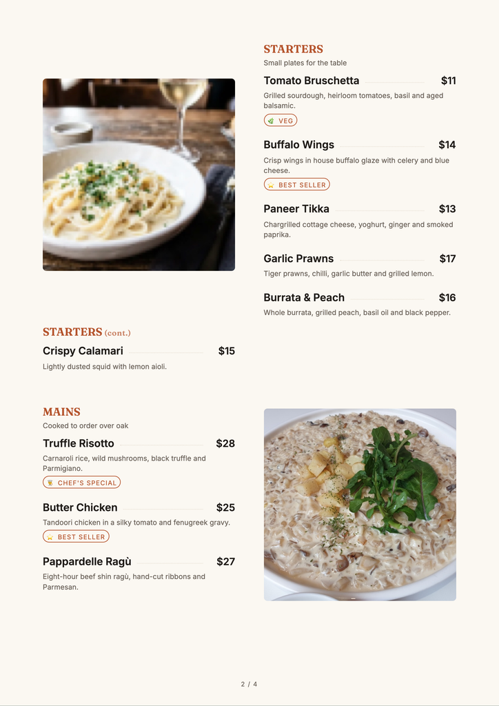
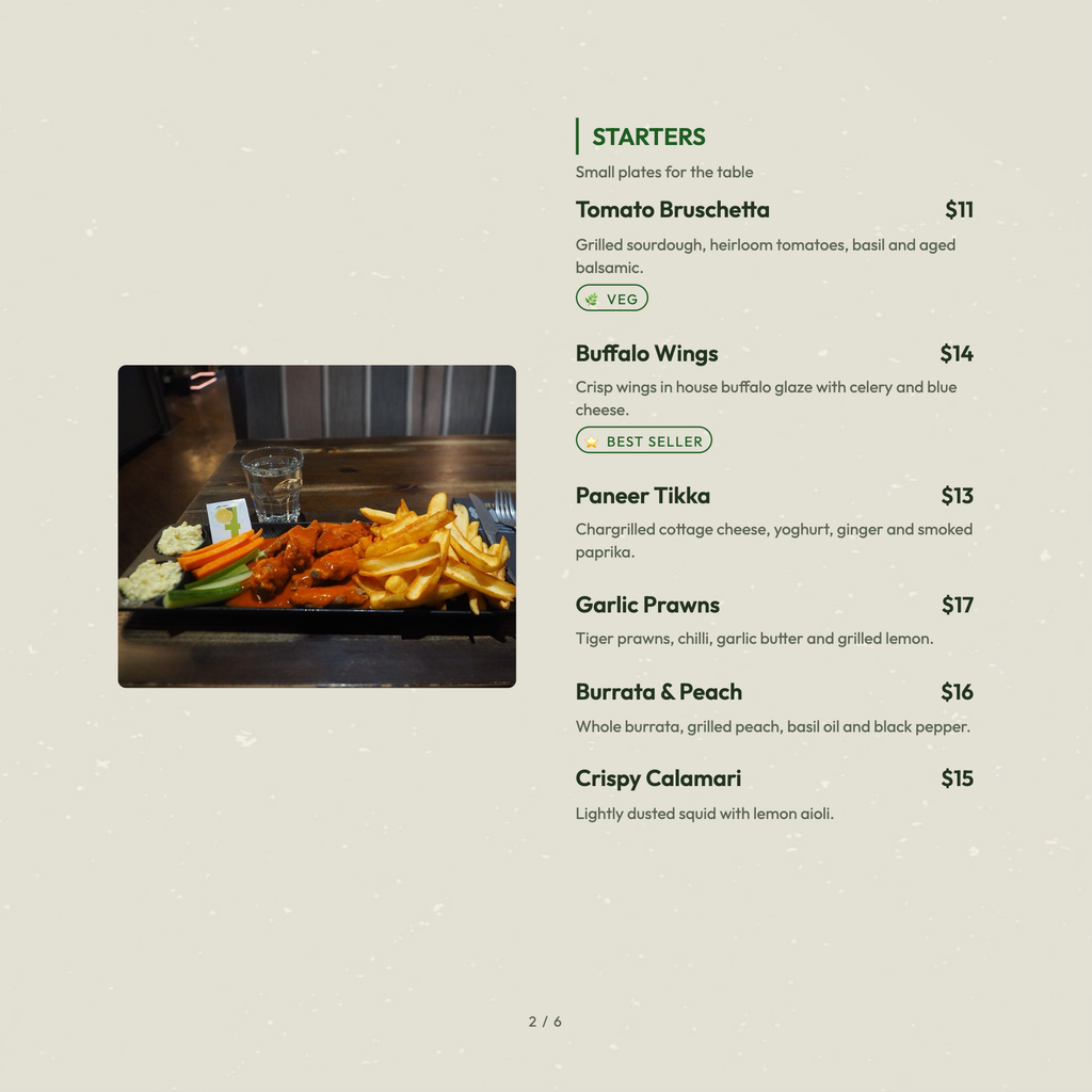
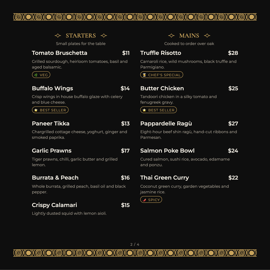
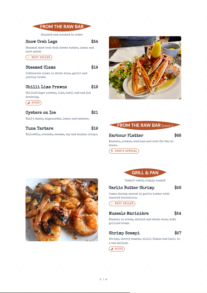
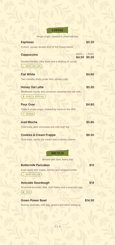
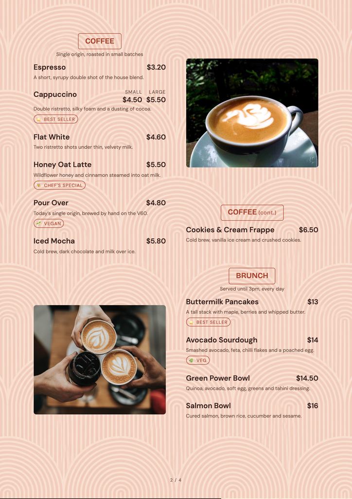
Premium menus work through restraint: more white space, fewer dishes per page, quality paper, and nothing shouting.
- Black and gold minimal. Matte black card, gold foil logo, cream inner pages. Classic for fine dining and hotel bars.
- Ivory with a single accent colour. Off-white textured paper, one brand colour for headings. Ages well and reprints cheaply.
- Leather-bound menu book. Leatherette cover with blind-embossed logo and replaceable inner sheets. Pays off when your prices change often.
- Chef’s tasting menu card. One slim card per course sequence, printed fresh for each service. Ideal for set menus.
- Wooden clipboard menu. A wood board with a clip holding a single printed sheet. Upmarket but casual, and the sheet costs very little to replace.
- Two-language layout. English beside Hindi or the regional language, with a clear grid. Useful for heritage hotels with foreign guests.
- Typographic only. No photos, just well-spaced type in two fonts. Looks expensive because it is confident.
5 star hotel menu card PDF: if you send menus to event planners or corporate clients, keep a print-ready PDF and a lighter screen PDF (under 5 MB) so it opens on phones.
Indian restaurant menu card designs
- Royal Mughal border. Jaali or arch pattern framing each page, maroon and gold. Suits North Indian and Mughlai kitchens.
- Rajasthani motif. Block-print patterns in the margins, warm earthy colours.
- Madhubani or Warli accents. Folk-art illustrations used sparingly as section dividers.
- Banana leaf South Indian. Green leaf textures, clean layout for dosa, idli and meals.
- Coastal / Konkani. Sea blue and white, with simple fish and coconut line art.
- Punjabi dhaba style. Bold type, truck-art colours, big section headings. Loud on purpose.
- Thali-focused card. A photo or illustration of the thali at the top, with what is included listed around it.
- Modern Indian. Clean sans-serif type, one spice-coloured accent, photos of three or four signature dishes only.
Veg hotel menu card designs

- Green and white pure veg. A clear “Pure Veg” mark at the top so guests don’t have to ask.
- Jain-friendly sections. A separate column or icon for Jain preparations (no onion, garlic or root vegetables).
- Udupi style. Simple two-column list, big readable prices. Works because the menu is long and guests are regulars.
- Satvik / temple-town style. Saffron and cream, minimal decoration.
- Veg thali hero layout. The thali gets the top third of the page; a la carte below.
Veg hotel menu card PDF: keep the veg mark and “100% vegetarian” line on every page of the PDF, since guests often see only one page when it is forwarded on WhatsApp.
Cafe, fast food and multi-cuisine designs
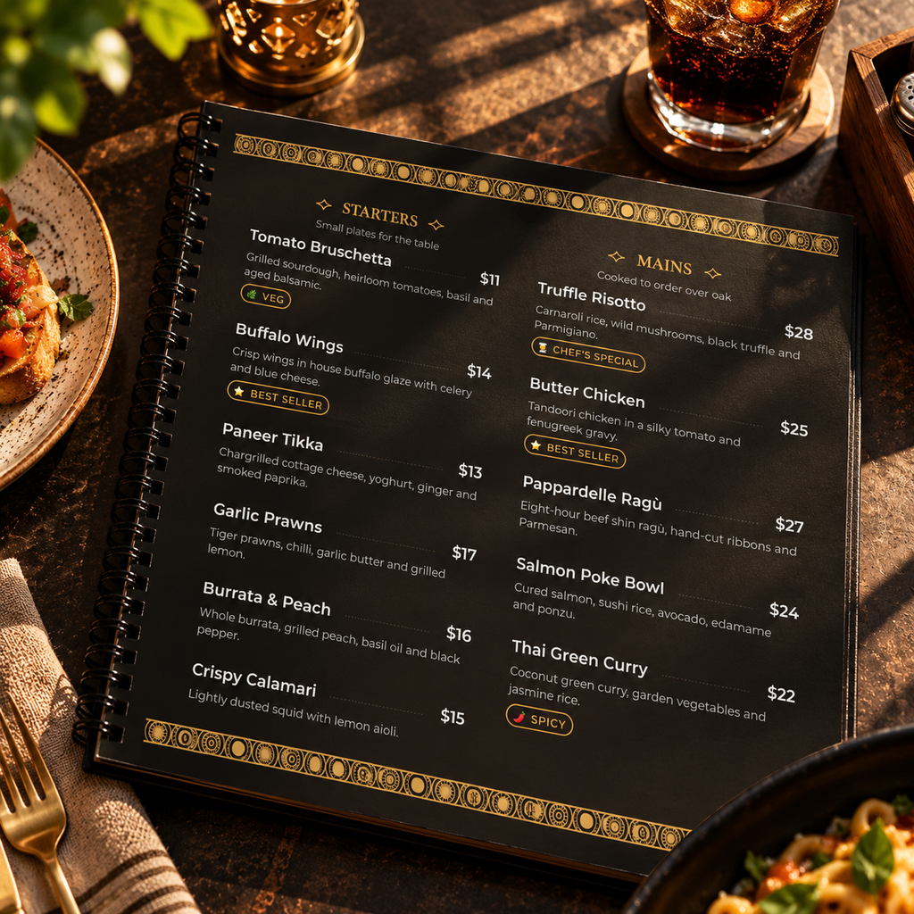
- Chalkboard style. Dark background with hand-lettered look. Easy to read on a wall board; harder in a small handheld card.
- Kraft paper. Brown recycled stock with black print. Cheap to produce, looks deliberate.
- Bright fast-food grid. Photos of combos with large prices. Here photos really help, because guests order by picture.
- Multi-cuisine tabbed book. Coloured tabs for Indian, Chinese, Continental so guests jump to a section.
- Single-page A3 broadsheet. Newspaper-style layout for a large menu without a book.
- Placemat menu. Menu printed on disposable paper placemats. Practical for high-volume hotels.
Formats for specific situations
- Room service card. Short menu, kitchen hours and the extension number at the top.
- Banquet / wedding menu card. One card per table listing the courses for the event, no prices.
- Breakfast card. Separate small menu so the main menu stays clean.
- Table tent for specials. A small standing card for today’s specials, desserts or drinks.
- Kids’ menu. Fewer items, smaller portions, something to colour on the back.
- Bar and beverage card. Separate from food so a price change on spirits doesn’t force a full reprint.
- QR table card. A small card or sticker with your logo and a QR code that opens the full digital menu.
Design principles that hold for all of them
- Use two fonts at most: one for headings, one for everything else. Body text no smaller than 10–11 pt in print, because many guests read in dim light.
- Put your most profitable dishes where eyes land first: the top of each section, or inside a simple box. Don’t box more than one or two items per page, or the box stops working.
- Keep 7 or fewer items per section where you can. Long lists slow decisions and push guests toward the cheapest familiar dish.
- Use photos only if they are good. One professional photo beats ten phone photos. Bad food photos lower what guests are willing to pay.
- Leave space. Crowded pages are the most common sign of a menu nobody planned.
Menu card size, paper and finishes
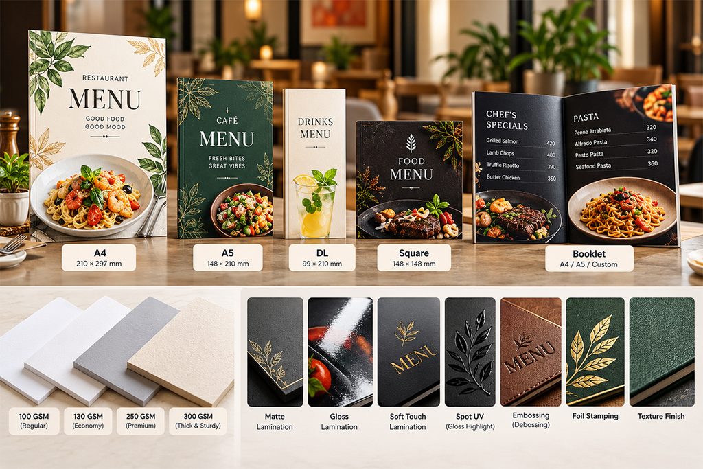
Choose the size from the number of dishes, not from what looks impressive. An oversized card on a small table gets knocked into glasses and folded at the corners within a week.
Common hotel menu card sizes
| Size | Dimensions | Fits roughly | Good for |
|---|---|---|---|
| DL | 99 × 210 mm (3.9 × 8.3 in) | 10–15 items | Desserts, drinks, specials |
| A5 | 148 × 210 mm (5.8 × 8.3 in) | 15–25 items per side | Cafes, room service |
| A4 | 210 × 297 mm (8.3 × 11.7 in) | 25–40 items per side | Most hotels and restaurants |
| US Letter | 8.5 × 11 in | Same as A4 | Printing in the US |
| Legal / tall | 8.5 × 14 in | 40–50 items per side | Long single-sheet menus |
| A3 folded to A4 | 297 × 420 mm flat | 60–90 items over 4 panels | Multi-cuisine bi-fold |
Item counts assume a short description per dish and comfortable spacing. If you are trying to squeeze more onto a page than this, the menu is probably too long, not the paper too small.
Paper weight
- 300–350 gsm card: the standard for single-sheet menus that will be laminated or handled daily.
- 170–250 gsm: inner pages of a menu book that sit in sleeves or a cover.
- 100–130 gsm: disposable menus, placemats and daily specials.
Finishes: which ones are worth it
| Finish | Worth it when | Skip it when |
|---|---|---|
| Matte lamination | Menus handled every day; it resists stains and doesn’t reflect light | You change prices every few months |
| Gloss lamination | Fast-food menus with photos | Fine dining; glare makes it look cheap under spotlights |
| Soft-touch lamination | Premium covers | Inner pages that get greasy |
| Synthetic (waterproof) paper | Busy outlets with spills; it survives wiping without lamination | Short runs where cost per sheet matters |
| Foil or spot UV | Cover logo on a premium card | Inner pages, or more than one element per page |
| Embossing | Leather or heavy card covers | Anything you will reprint often |
Our honest view after years at the press: lamination and foil are where most of the money goes, and they lock you in. A beautiful laminated card is still a pile of waste the day your paneer price goes up.
How much does a hotel menu card cost?
The printing is rarely the expensive part. The real cost is design time plus every reprint you pay for over the life of the menu.
The ranges below are typical of what we have quoted and seen quoted. Prices vary a lot by city, quantity and printer, so use them to sanity-check a quote, not as fixed rates.
| Item | Typical range (USD) | What drives the price |
|---|---|---|
| Menu design by a freelancer | $50–$300 | Number of pages, revisions, whether they write the descriptions |
| Menu design by an agency | $300–$1,500+ | Brand work, photography, multiple menus |
| Food photography | $150–$800 per shoot | Number of dishes, styling, location |
| Single-sheet A4, laminated | $1–$4 per copy | Paper, lamination, quantity |
| Bi-fold A3 card, laminated | $3–$8 per copy | Folding, paper weight, quantity |
| Menu book with cover and sleeves | $10–$40+ per copy | Leatherette vs printed cover, page count |
| Table tents | $0.50–$2 per copy | Size, paper, quantity |
A quick example
Say a 60-cover hotel orders 40 bi-fold laminated menus at $5 each. That’s $200 in printing on top of, say, $200 for design: $400 in total.
Now the owner changes prices twice in a year and adds a new section once. Each change means paying the designer for edits and reprinting all 40 copies. Three changes at roughly $250 each adds $750. The menu that looked like a $400 job has cost about $1,150 in its first year, and the copies on the tables were out of date for weeks while the reprint was arranged.
Where owners overspend
- Printing 500 copies to get a low per-copy price when you need 40. The unused 460 go in the bin at the first price change.
- Paying for foil, embossing and spot UV on inner pages that nobody looks at twice.
- Leather menu books for a casual restaurant where guests would be just as happy with a clean laminated card.
- Redesigning from scratch every time instead of asking the designer for editable source files (AI, PSD, InDesign or Canva) on day one. Always get the source files. Without them you are tied to one designer for every edit.
- Putting prices on the expensive cover. Keep prices on inner sheets or inserts that are cheap to replace.
12 menu design and printing mistakes we fix most often
Almost every menu that comes to us for a redo has at least three of these.
Design mistakes
- Too many dishes. A 120-item menu means more inventory, more waste and slower decisions. Cut the dishes that rarely sell before you design anything.
- Fonts that are hard to read. Script fonts for dish names, light grey text, text on top of a busy photo. If you have to tilt the card toward the light, guests will too.
- Prices in a neat right-hand column. It turns the menu into a price list and pushes guests to the cheapest line.
- Spelling mistakes. “Panner”, “Biriyani” and “Chiken” in 5,000 printed copies. Have two people who didn’t write the menu proofread it.
- Low-resolution logos and photos. An image that looks fine on a phone screen prints blurry. Print needs about 300 dpi at the final size.
- No veg/non-veg or allergy marks. Guests ask the waiter, the waiter checks with the kitchen, and the table waits.
Printing mistakes
- Approving colours on screen. Screens glow; paper doesn’t. Your brand maroon can print as brown. Ask for a printed proof before the full run.
- No bleed. Backgrounds and borders that run to the edge need 3 mm extra on every side, or you get thin white lines after cutting.
- Text too close to the edge or the fold. Keep at least 5 mm of safe margin; more near folds.
- Sending an RGB file. Most offset printers need CMYK. Converting at the last minute shifts colours.
- Wrong paper for the finish. Thin paper laminated on both sides curls; uncoated paper takes spot UV badly.
- Over-ordering. Order what covers your tables plus about 20% spare for damage. Reprint small batches when needed.
Pre-print checklist
- Every price checked against the current price list
- Spelling checked by two people
- Veg/non-veg, spice and allergen marks added with a key
- File in CMYK, 300 dpi, with 3 mm bleed and 5 mm safe margin
- Printed proof seen and approved
- Quantity = tables + 20%
- Editable source file saved with you, not only with the designer
Printed vs digital menu card: which should you choose?
For most hotels the answer is both: a well-designed printed card for the table, and a digital version for everything that changes or travels.
| Printed menu card | Digital / QR menu | |
|---|---|---|
| Feel at the table | Tactile, works for every guest | Depends on the guest’s phone and comfort with it |
| Changing a price | Edit, proof, reprint, wait | Update and it is live |
| Daily specials and sold-out items | Table tents or the waiter | Show or hide in seconds |
| Multiple languages | Extra pages or separate cards | Easy to add |
| Sharing on WhatsApp, Google, Instagram | A photo or a heavy PDF | A link |
| Ongoing cost | Every change is a reprint | Mostly fixed |
| Best for | Fine dining, older guests, the core menu | Menus that change, delivery, events, takeaway |
Print still matters. Some guests will always prefer to hold a card, and a premium restaurant may never want phones on the table. The mistake is using print for the parts of the menu that change every week.
Why we built MenuFly
After 15+ years of designing and printing menus, we kept seeing the same pattern. Owners paid properly for a good design, then lost money and time on every small change after it: a price update, a new dish, a seasonal special. Many smaller hotels skipped design altogether because a professional menu felt out of reach.
We launched MenuFly to fix that. It puts the layouts, type choices and print rules we use for clients into a tool restaurant owners can use themselves, so they get a professional-looking menu without paying for design on every change, and print only when print genuinely makes sense.
If you would rather work with a designer and a printer, the advice in this guide applies just the same. The goal is a menu that sells, not a particular tool.
How to make a hotel menu card, step by step
This is the order we follow with clients. Skipping the first two steps is what usually leads to a redesign six months later.
- Review what sells. Pull three months of sales from your billing software. Mark each dish as a high or low seller and as high or low profit. Cut or rework the dishes that are low on both.
- Fix your prices. Work out food cost per plate before you design. Changing prices after printing is the most expensive edit there is.
- Write the content. Dish names, 10–15 word descriptions, veg/non-veg marks, spice and allergen notes, taxes and service charge line, timings, phone number.
- Choose the format and size. Use the item count from the size table above. Decide what stays printed and what goes digital.
- Pick a design direction. Choose one idea from the list that matches your interiors and price level. Collect two or three reference menus you like.
- Lay it out. Courses in eating order, high-profit dishes at the top of sections, two fonts, plenty of space.
- Proofread, then proof again. Two people, on paper, not on screen.
- Get a printed sample. Check colours, readability in your actual lighting, and how it sits on your table.
- Print a small batch. Tables plus 20%. Keep the editable file.
- Watch and adjust. After a month, check whether the dishes you highlighted sell more. Move what isn’t working.
Frequently asked questions
What is the meaning of menu card?
A menu card is a printed or digital list of the food and drinks a hotel or restaurant serves, with their prices. Guests use it to choose and order, and the restaurant uses it to present its food and brand.
What should be written on a hotel menu card?
The hotel name and logo, dishes grouped by course, a short description and price for each dish, veg/non-veg marks, spice or allergen notes, a line on taxes or service charge, opening hours and a contact number.
What is the standard size of a hotel menu card?
A4 (210 × 297 mm) is the most common size for a single-sheet hotel menu. A5 suits short menus and room service. Larger multi-cuisine menus usually use an A3 sheet folded to A4, or a menu book.
Which paper is best for a menu card?
300–350 gsm card with matte lamination for menus handled daily. Synthetic waterproof paper for busy outlets with frequent spills. 170–250 gsm for inner pages that go inside a cover.
How many items should a hotel menu have?
As few as you can sell well. Aim for about 7 items per section, and cut dishes that sell rarely and earn little. A shorter menu also means less stock and less waste in the kitchen.
Should I put photos on my menu card?
Only professional ones, and only for a few signature dishes. Fast-food and combo menus benefit most from photos. Fine-dining menus usually look better with type alone.
How do I make a 5 star hotel menu card design?
Use fewer dishes per page, generous white space, a restrained palette (black, ivory, one accent), quality textured paper and a single premium finish such as foil on the cover logo. Restraint is what reads as luxury.
Can I get a hotel menu card PDF or template?
Yes. Download the sample hotel menu card above as a starting point, then replace the dishes and prices with your own. Keep a print-ready PDF for the printer and a lighter version for WhatsApp and your website.
Is a QR menu better than a printed menu?
Neither is better for everything. Printed menus give a better table experience; digital menus are faster and cheaper to keep up to date. Most hotels do well with a printed core menu and a digital menu for specials, delivery and sharing.